
10 KiB
[Q] Formatting stories - any good evidence?
-
Author: u/DataPacRat Amateur Immortalist*
-
URL: https://www.reddit.com/r/rational/comments/2isxav/q_formatting_stories_any_good_evidence/
-
Score: 8
-
Created: 2014-10-09T22:45:19
Post:
I've started toying around with setting up my story at its permanent website, and have put a test page of the first chapter at this page (NSFW due to image of tasteful female nudity). I find myself faced with all sorts of options - font? line width? dark on light or light on dark? inline style or CSS? spot colors? hyphens or em-dashes? straight or curly quotes? etc, etc? - and I don't have a lot of evidence to base any answers on.
As a preliminary set of answers, I've drawn on Butterick's Practical Typography, even though I don't have any particular reasons to favour that set of advice over any other, other than that it's a concentrated dose of a /lot/ of advice. I don't know how to set up formatting for multiple viewing devices, I've never touched CSS, and my budget for fonts or professional advice is pretty much zero.
Does anyone reading this know where I can find evidence that any changes I could make to my preliminary formatting would do any better than what I already have?
Comments:
u/None [+5] (an hour later)
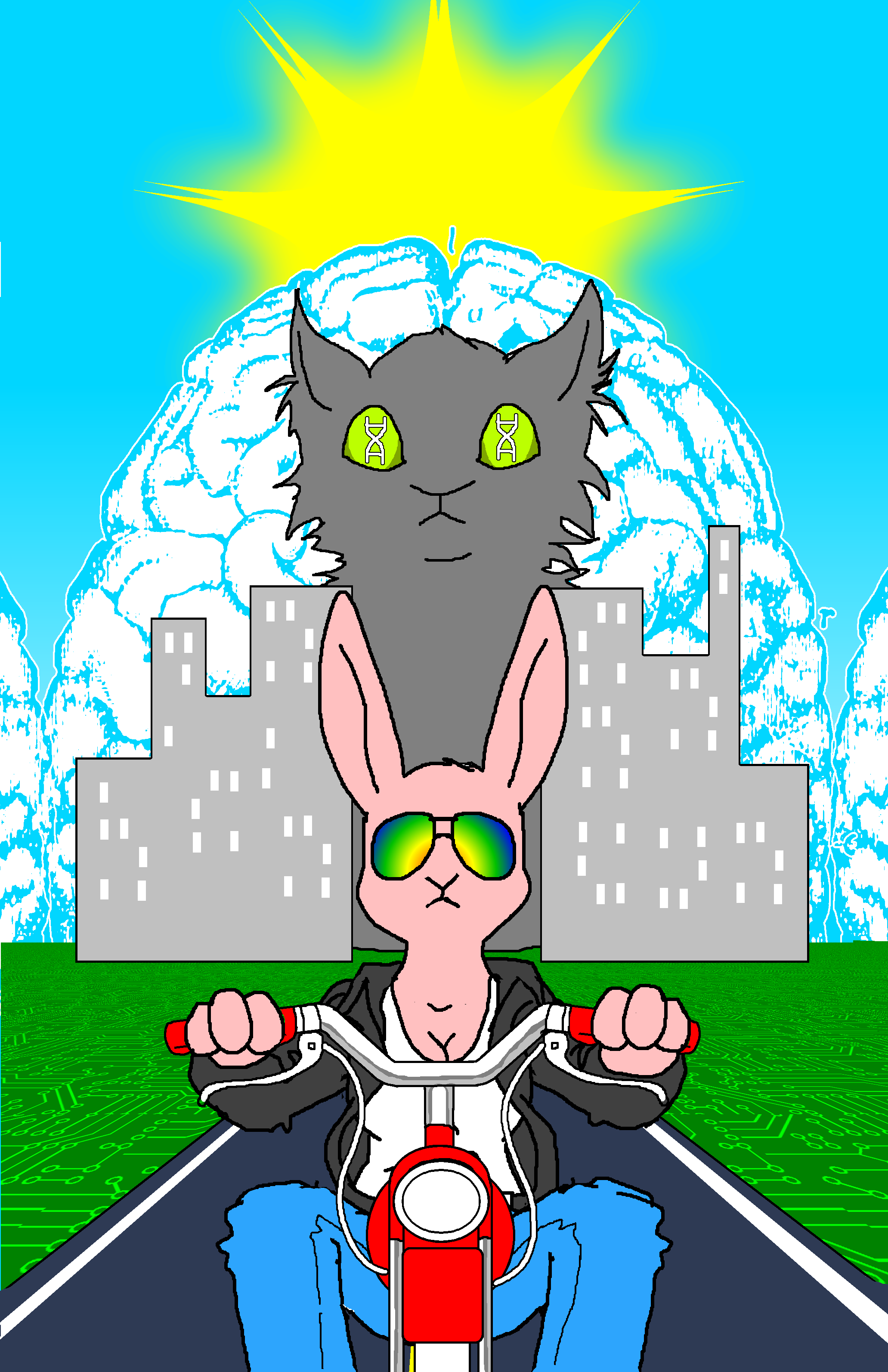
I like it so far. Butterick is a fantastic source, and it's good to see someone else using it. But about that picture at the top ... Does it really belong at the top? Or does another picture work? I know it's relevant (sorta), but not gonna lie, when I saw it my first reaction was to roll my eyes and move to close the tab. It was only when I saw the url that I stopped and scrolled.
Or maybe I'm just unfairly prejudiced against furries, or something. I'll review my biases.
u/DataPacRat [+2] Amateur Immortalist (an hour later)
The only other image I have that's suitable for the beginning is http://www.datapacrat.com/SI/SI-cover-page.png , which I'm planning on putting on the index/table-of-contents page instead of the first chapter.
I could certainly move the image down a few sections, such as to shortly after the brain transplant, if having it at the /very/ start is that off-putting.
u/_brightwing [+2] Feathered menace (4 hours later)
I didn't see the first version, but that works great thematically. Right at the end of the section when he faints seeing the mass of fur. Very much adds to the hilarity of the moment. Sets precedent for future illustrations too.
Liking the triangle theme of the title as well. Looks nice and minimalistic. Consider changing “Book One: Re- / Chapter One: Re-Awakening” to a slightly lighter shade of blue though. Maybe colour #0162e1 ? It looked alright in photoshop when I messed around with a screenshot of yours..
If you're looking into heading font choices, Tahoma, Cambria or Georgia could go well with the Calibri body text. It's fine as it is though. And for some reason authors I find always use a very dark shade of grey like #0f0f0f instead of plain black. Must be an aesthetic thing.
Oh, I found this bookmarklet the other day. Something if you wanted to identify font structures in places that particularly caught your eye. Hope you find it useful.
u/DataPacRat [+2] Amateur Immortalist (7 hours later)
You're not the only one who's suggested lightening the title; so I have.
For fonts, I've used this list as listing fonts that are most likely to exist on a user's system, sorted by this list for which are to be preferred; and at least for the moment, am trying out Cambria for the headers (with Georgia as a fallback).
u/qznc [+4] Chaos Legion (9 hours later)
Butterick's advice about buying your own font seems weird to me. Especially, since he is selling fonts himself. I never saw the need to buy a font. There is nothing wrong with standard fonts.
In your concrete case, I'd say increase line-height or decrease the width of lines. Are lines like "First Awakening" considered section titles? Then you should style them somewhat differently than the main text. Maybe center or right align or italic.
Another nice resource: http://webtypography.net/
u/DataPacRat [+1] Amateur Immortalist (9 hours later)
I'd say increase line-height or decrease the width of lines.
I've just added a quick HTML trick to maximize the line-width at about 2.3 full-alphabets, which should solve that.
Are lines like "First Awakening" considered section titles?
That was my original plan, but I stopped using them after the first chapter, so I'm not particularly concerned with emphasizing them.
Another nice resource
I look forward to reading through it, thank you. :)
u/i_dont_know [+3] (5 hours later)
Dark blue text on a black background (your chapter titles) is generally inadvisable. When I'm reading a story, I tend to prefer dark text on a lighter background, but there are plenty of scripts that will allow people to have the option.
I'm glad that you don't have the nude furry picture at the top of the page. I might hide the picture by default and have a "click here to see NSFW picture" where the picture should go in the text, and have some javascript show the picture.
For typography, please do use hyphens, em-, and en-dashes correctly. If you use a hyphen where an em-dash should be, on first read-through I will often read it as a hyphenated word, and it will take me a moment to realize that there should be a break in the sentence—confusing!
Here's a good reference on the different types of dashes
I prefer to write in pandoc-styled markdown, then use the cross-platform, free, and absolutely amazing pandoc utility to convert to practically any format under the sun, including html and epub. Pandoc even supports custom templates for all of its output file formats!
When using pandoc, I use the
-S(uppercase S) or--smartflags (they're the same) which:Produce typographically correct output, converting straight quotes to curly quotes, --- to em-dashes, -- to en-dashes, and ... to ellipses.
Writing in markdown means writing in plaintext, which means that I am not tied to a proprietary or closed-source application. It's safer even than ODF in that I expect computers will still be able to read the same
.txtfile 10 years from now, with no loss of fidelity! I can also manage my story through source control such as git, out of which I get versions and (free) backups through github if I want them.Anyway, that's my advice—thanks for writing!
u/DataPacRat [+1] Amateur Immortalist (8 hours later)
I might hide the picture by default
I find myself somewhat reluctant to require the reader to do anything but page-down through the text, and click on 'next page' links. I've used PICS to add content warnings that the picture contains artistic/tasteful nudity, so anyone who's set their browser to filter out such material won't see the image.
please do use hyphens, em-, and en-dashes correctly.
There seems to be a certain amount of disagreement about what 'correctly' means, but I think I've worked out a reasonable compromise for most instances. Hyphens for word-joining - and a thinspace, em-dash, thinspace combo for parenthetical dashes. At least in the first chapter, I don't think I found any instances of en-dashes. (And I'm using the ellipsis character instead of three periods, left and right curly quotes for speech, ordinary apostrophes inside words but curly apostrophes for quoted text.)
writing in plaintext
That's what I do, already. :) (A few decades of doing so is why I instinctively write italics like /this/.) I'm probably just going to manually convert to HTML - once I've worked out which HTML tags to actually /use/, it's not hard to rock my fingers back and forth through a set of search-and-replaces (such as greater-than followed by quotes into left double-quotes; space followed by quotes into left double-quotes; and the remaining double-quotes into right double-quotes), and it's something I can do while a distracting TV keeps me from doing any creative writing.
(Not that I object to automation, either; but from what I've managed to read of pandoc's documentation so far, there doesn't seem to be an easy way to turn a text file containing ten chapters into ten HTML files based on the format I'm establishing in my 01-01.html test-file. With my current level of knowledge, it looks like it'll be easier to manually generate the HTML than learn whatever scripting language would be used to automate the conversion.)
u/Tayacan [+1] (11 hours later)
Take a look at http://readable.tastefulwords.com/ - I just use it with the default options. If you make it similar to that, you won't go wrong.
If the font size is large enough, I think serif fonts win over sans-serif - the main reason to use sans-serif fonts is that they do better at small sizes, which is what you often have on a screen, but I can see that you have made the font quite large (which is good).
Dark gray text on a light gray background is good for reading on screens - it's less bright and constrast-y than black on white. White on black isn't the worst you could do, but it does start to strain the eyes after a while.
u/DataPacRat [+2] Amateur Immortalist (13 hours later)
serif fonts win over sans-serif
The evidence seems to be mixed: https://en.wikipedia.org/wiki/Serif#Readability_and_legibility .
start to strain the eyes after a while
Are you sure? My personal experience is the opposite. Thinking about it, much of my computing time is spent in shaded or darkened rooms, which might not reflect most users' experience; but I'm reluctant to make the page less readable to myself, the authour.
I might eventually go looking for some sort of CSS style switcher to flip between light and dark, though such a thing is currently beyond my abilities.
(On a somewhat related note, I've tidied up the story's main page, at http://www.datapacrat.com/SI/index.html , a bit, at least compared to the initial ugly placeholder page.)